Size Matters: The Importance of Letter Sizing in Business Signs
- September 22, 2017
- Posted by: Ryan Brady
- Category: Branding, Custom Signage, Design, Letter Sizing, Sign Installation, Sign Maintenance, Signage Benefits
Have you ever driven past a business, squinted at the sign, and realized that you still have no idea what kind of business it is? If so, you begin to understand that a badly-designed sign is just as problematic as no sign at all. If you don’t pay attention to design details such as the font, color, and letter sizing in business signs, it can greatly affect your ability to clearly communicate your brand to potential customers.
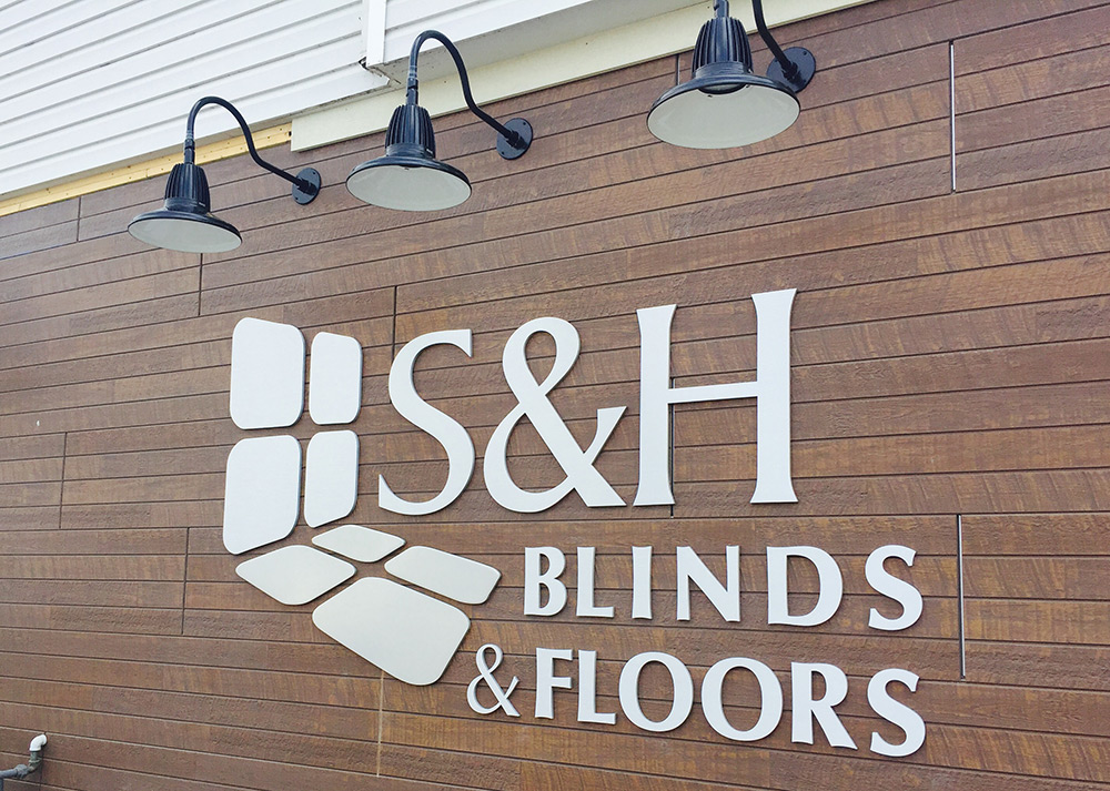
Too Big or Too Small: Why Letter Sizing in Business Signs Matters
Whether your sign will be a more conservative design for a leased office space or a flashy, fluorescent sign for a line-dancing country and western bar, size matters. If the letter size is too small, passersby won’t be able to read it from far away and they’ll, well, pass right on by. Business signage should be easily readable with a quick glance; most people won’t take the time to do more than that unless they’re specifically looking for your business.
Overly-large letter sizing in business signage isn’t much better, as it will look awkward and unprofessional. A happy medium between squinty-small and Godzilla-sized will bring the attention your business deserves in a way that looks great and provides credibility.
Font Color and Type
Letter sizing in business signs is not the only consideration when creating a design. Font color and type will also come into play.
Imagine a law firm sign that’s multi-colored and done in a font that looks like crayon print. Meanwhile, visualize a daycare with its name printed in raised black lettering in a very conservative font.
At first glance, you’d get the wrong idea about both businesses, wouldn’t you? Flip the two design motifs and it changes things drastically: the daycare’s branding should promote whimsy and fun while the law firm’s sign should be serious and straightforward. Font color and type send an immediate message about exactly what your brand and business are about.
In addition to choosing a font style that’s appropriate for your brand, it’s important to choose one that’s easy to read. While a curlicue-cursive font may elegantly represent your dog grooming boutique, it may be tough to decipher from a distance. Consider not only what a sign will look like when you’re standing still and looking at it up close, but how it will appear when you’re whizzing past in a car at a distance.
Why Sign Placement Can Make or Break Your Business
Your sign may be the most brilliant thing ever. It may make clever use of your business name, feature stunning effects and beautiful colors, and be in a font that’s boldly visible for miles around. If it’s all of these things and is placed in a bad location, none of it matters.
What makes a good sign location? First, it needs to be easily visible from nearby roadways. This means that it must be tall enough to be seen from a distance.
Next, it’s imperative that your sign is free of any obstructions. This includes trees and vegetation, power and telephone poles, buildings, and signs for other businesses. If unobstructed sign placement is going to be a challenge, your design company can work with you in order to create a sign that can be installed in a visible location.
Let There Be Light
If your sign will be installed in a dark location or if you need it to be visible at night, make sure you choose a lighted design. This is an important tip, especially for outdoor business signage. It’s a real tragedy when businesses spend money on a beautiful sign only to have it obscured by shadows or become completely invisible once the sun sets.
With a little forethought into font color, style, and letter sizing in business signs, your organization will soon be on the path to attracting new attention — and scoring new business.
At Brady Signs, we’re a third-generation family business that’s served as a premier provider of business signage solutions throughout the North Central Ohio region and beyond for nearly 50 years.
Want to learn how we can convert your brand into a statement using our eye-catching signage for business? We’re here to talk.