Creating Attention Grabbing Signs That Can’t Be Ignored
- May 21, 2021
- Posted by: Ryan Brady
- Category: Branding, Business Branding, Custom Signage, Design, Logo Design, Signage Benefits
Business signs tell customers a lot about your business, such as your commitment to customer services, professionals, products and services, and more. According to the International Sign Association, captivating signs can get businesses 50% of their customers. Therefore, if you want to grow your customer base and increase your sales, you need to create attention grabbing signs to get noticed.
Quality signage is an effective and easy way to communicate with your customers and drive more traffic to your office or retail store. You might have the best of products or services, but they will do you little good if the only sign on your store is hanging on the window. Remember, attention grabbing signs leave long-lasting impressions.
Ideas to Help You Design Attention Grabbing Signs
Here are some ideas to help you create attention grabbing signs:
Pick the Right Contrast
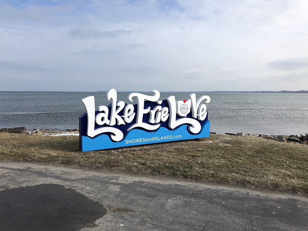
Choosing the right contrast helps in enhancing the overall appeal, readability, and visibility of your sign. It works best when the sign’s background and text colors are opposite. In simpler words, the contrast between the background and text will determine how well people can read your sign, especially from a distance.
Research shows that about 8 in 10 or approximately 76% of customers enter a store or business location, based solely on the sign. Therefore, your business sign must draw customers’ attention immediately.
Pairing similar colors in the background and text can make it difficult for prospects to read your signs. Not only the sign’s background color but you also need to check its surroundings. For example, if you hang a sign with a brick-colored background on a brick wall, the camouflage won’t allow it to get noticed quickly.
Per the Outdoor Advertising Association of America, these are the 5 most attention grabbing contrast colors for retail signs:
- Black text on a white background
- Black text on a yellow background
- Yellow text on a black background
- White text on a blue background
- Green text on a white background
Add Your Logo
If your business has a logo or even a mascot, ensure you add it to your business signs to instantly grab the attention of customers and prospects. It’s a great way to make your business recognizable. Also, it’s always a good idea to ensure your business signs match your brand.
Choose the Fonts Wisely
The font you choose for your sign can also play a critical role in grabbing the attention of both customers and prospects. Therefore, ensure you pick clean and bold fonts; they work the best.
As much as possible, keep the fonts consistent across all your signs and marketing collateral. Try to avoid using more than one font.
Also, carefully plan the layout of your signs. The largest font sizes grab readers’ attention first. Therefore, ensure they comprise your key message. Then you move to the second largest, third-largest, and so on.
Ensure the Signs Are Readable and Not Cluttered
The most important aspect of enhancing the readability of your signs is ensuring your customers and prospects can distinguish between letters and words. When designing a business sign, it can be tempting to add a lot of information. However, that’s not a good idea. The more space on your signs, the better will be its readability.
Your signs need to be clear, yet captivating. Follow the five-second rule. If you can convey the key theme of your business signs in under five minutes, you’re good to go. If it takes longer, consider removing unnecessary information.
Use the Right Letter Case and Height
While it’s a good idea to use all CAPS or UPPERCASE letters for your business name or words such as “DISCOUNT” or “SALE,” avoid using it for other sections of the text.
The letter size is another parameter you need to evaluate. The larger the letters, the easier they are to read. This is especially important if you are designing signs that will be displayed on the roadside or at a distance. The “10 feet per inch of the letter height” is a good rule of thumb for determining the letter size for your business signs. For instance, letters that are 20 inches in height may have the best impact at a 200 feet distance.
Include Specific Details
You can make your business signs attractive by incorporating the right message in the right place. This is known as “narrowcasting.” Therefore, when designing your business signs, include specific information such as relevant product/service information or location-specific instructions.
At Brady Signs, we’re a third-generation family business that’s served as a premier provider of business signage solutions throughout the North Central Ohio region and beyond for nearly 50 years.
Want to learn how we can convert your brand into a statement using our eye-catching signage for business? We’re here to talk.