Attract More Attention With These Sign Design Tips
- July 20, 2018
- Posted by: Ryan Brady
- Category: Branding, Custom Signage, Design, Letter Sizing, Sign Installation, Sign Maintenance, Signage Benefits, Signage Strategies

Installing a custom sign is a huge step for any business. It can present an excellent opportunity to garner more attention for your brand, your product/service, and your business overall. It also presents the opportunity for potential pitfalls that many business owners fall into when designing their signs. To avoid spending money on a sign that turns out to be an epic fail, these sign design tips will set you on the right path.
4 of Our Favorite Sign Design Tips
1. Use Bigger Letters and Fewer Words
We get it — there’s a lot you’d like to communicate with your business signage. Maybe you’re a gourmet sandwich shop. You bake all of your own bread and use the freshest ingredients. Everything is hand-sliced the day you use it. Your shop is family-owned and operated, meaning that everyone who works there really cares about their products and customers.
As much as you’d like to, you can’t communicate this in so many words on your sign, so you’ll need to figure out a way to do it with fewer words. A clever, custom-designed logo can go a long way towards telling your company’s story in a visual way. If you do use words, choose a select few to convey your message. If your sign gets too wordy and crowded, passersby won’t have the time or inclination to stop and read the whole thing.
2. Negative Space Matters
There’s a lot to consider when thinking of the overall design of your business signage. As you envision what the finished product will look like, keep in mind that what you don’t put on your sign matters just as much as what you do put there.
In other words, negative space matters. That empty space on your sign will make each of your letters or graphics truly pop. Avoid creating a sign with a busy background. Negative space is great to separate words and make letters more readable. If you think of some of the world’s most recognizable signs and logos, they’re full of negative space. Two that immediately come to mind are the golden arches for that fast-food restaurant whose mascot is the smiling clown (you know the one) and the minimalist logo that’s likely emblazoned on the back of the phone you have in your hand now (Steve Jobs was definitely a believer in less being more).
3. Go Unusual
One of the most effective sign design tips is to create something that will have your audience doing a double-take. A sign that simply read’s “Jenny’s Ramen” might not stand out, but a smiling bowl of noodles waving a pair of chopsticks certainly will! Get creative with your signage. Not only will it attract more attention; it will help you stand out from your competitors.
4. Play With Visual Patterns
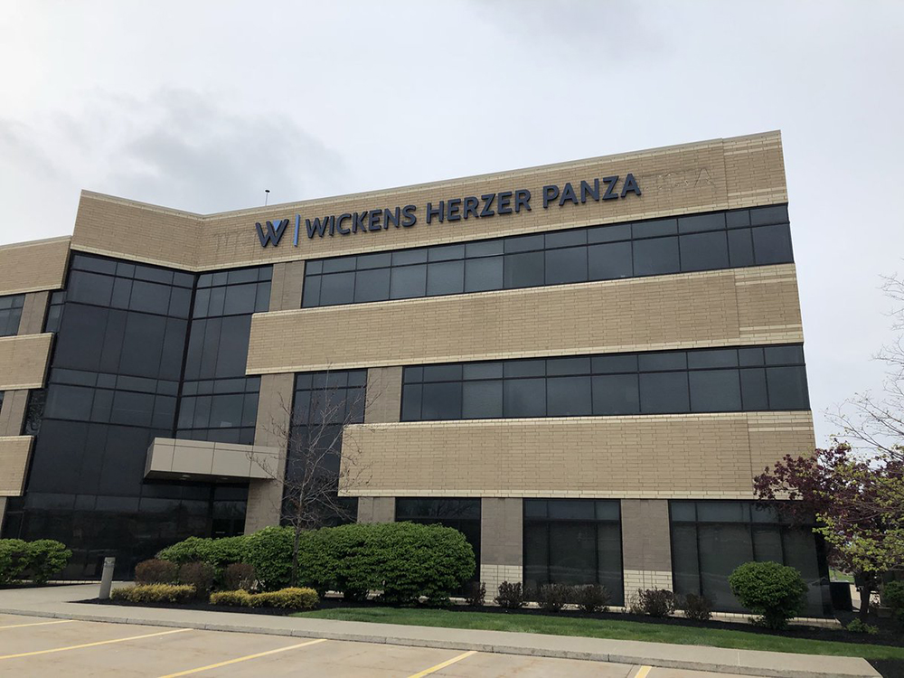
Finally, it’s important to toy around with different ideas while staying within the visual patterns that are typical of your industry. What do we mean by this? Imagine the sign for a cold-pressed juice bar. You’re likely to find colors that make you think of fresh veggies (carrot orange and wheatgrass green), as well as a clean, minimalist font. The sign for a university building, meanwhile, will be more conservative and straightforward – something like white aluminum letters on brick would be typical of this type of organization.
When considering sign design tips, it’s important to remember that while you’re being creative and unexpected, your sign still needs to stay true to your industry. When customers glance at it, they immediately need to connect it with whatever you do (computer repair? medical practice? daycare?). Once you’ve taken the time to design and install the perfect sign, you’ll find that it’s an investment that will provide huge returns in the years to come.
At Brady Signs, we’re a third-generation family business that’s served as a premier provider of business signage solutions throughout the North Central Ohio region and beyond for nearly 50 years.
Want to learn how we can convert your brand into a statement using our eye-catching signage for business? We’re here to talk.
