Too Big or Too Small? How to Pick the Right Signage Letter Size
- September 10, 2021
- Posted by: Ryan Brady
- Category: Design, Letter Sizing, Sign Installation, Signage Strategies
Signage letter size is the most critical aspect of business signs. After all, it will determine how well your message can be read from a large distance or enhance the overall letter height visibility. Therefore, the creative combination of sign color, design, content, and shape is not enough; you need to determine the right signage letter size to ensure your signs are clearly visible and eye-catching to attract prospective customers.
However, it can be a daunting task to choose the right letter size for your signs without little or no knowledge of letter height visibility. We’ve compiled a quick guide to help you pick the right signage letter size for your business signs.
Factors That Make a Sign Easy to Read
There are two things you must keep in mind while selecting the right signage letter size. These include:
- Distance between the signage and reader
- Time taken by an average reader to absorb the message on the sign
Your content needs to be large enough to ensure it can be easily read from a distance and concise enough so that an average reader can absorb it within the recommended readability time.
How to Determine the Right Signage Letter Size
For every 10 feet between the reader and your sign, add 1-inch height to the total height of your letters. Most people can easily read a 1-inch tall letter from a 10 feet distance. However, for a 40-feet distance, you’ll need letters that are at least 4 inches tall for perfect readability.
It’s not that people won’t be able to read the letters on your sign beyond the “perfect readability” parameters; however, external elements such as architectural elements, readers’ eyesight, and weather conditions will determine how much further they can see clearly.
Other Factors That Impact the Selection of Letter Size
Apart from the distance between the sign and the reader, and the time taken by an average person to read the message on the sign, here’s a list of some other factors that can help you pick the right signage letter size:
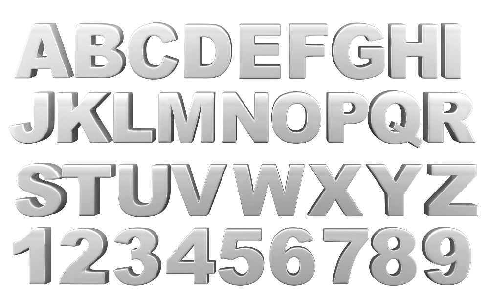
- Space Between the Letters or Kerning. Spacing the letter too close to each other can impact the readability of your signs and make the content very hard to read. Therefore, avoid placing the letters too close to each other.
- Thickness of the Letters. It can be difficult to read narrow letters. Therefore, we recommend selecting a bold font that is easily visible and attention-grabbing. You can test the visibility of the chosen letter width by printing the letters on a paper and sticking them on the wall.
- Font Colors. For the font, we recommend considering bold or strong colors as they’re easily visible to the naked eyes.
- White Space. White space is the vacant space around letters on your sign. For white, we recommend following the 40/60 rule. According to this rule, content should cover 40% of the space on a sign and white space should be around 60%. This will allow your content to breathe and make it more readable.
Formula to Determine the Right Signage Letter Size
This formula will help you to determine the right signage letter size:
LH = (TL x 10 + SD) / 5
- LH is the height of the letters in inches.
- TL is the number of traffic lanes.
- SD is the sign’s distance from the curb in feet.
Here’s a quick example to help you understand the formula better.
- 4 lane roadway
- Sign distance is 40 feet from the curb
- LH = (4 x 10 + 40) / 5 = 16
- Therefore, the required letter height should be 16 inches
At Brady Signs, we’re a third-generation family business that’s served as a premier provider of business signage solutions throughout the North Central Ohio region and beyond for nearly 50 years.
Want to learn how we can convert your brand into a statement using our eye-catching signage for business? We’re here to talk.