Professional Service Signage: Building Trust Through Quality Presentation
- March 20, 2026
- Posted by: Ryan Brady
- Category: Professional Service Signage
Trust determines everything when it comes to professional service signage. Clients choose attorneys, accountants, medical providers, and consultants based largely on perceived credibility and competence.
Your signage creates the first impression that either builds or undermines trust before prospects walk through your door, making it essential for establishing credibility. Explaining how specific design elements influence client perceptions can help you craft signs that genuinely reinforce your professionalism and trustworthiness.
Professional service signage operates under different rules than retail or restaurant signs. Flashy doesn’t work. Desperate doesn’t work. Cheap definitely doesn’t work.
Your signs should convey an understated quality that reassures your clients of your competence, permanence, and attention to detail, helping them feel confident in your professionalism.
Let’s examine how professional services create signage that builds credibility rather than damaging it.
Understated Elegance Over Flashy Retail Approaches
Retail businesses compete for attention with bold colors, large graphics, and eye-catching elements designed to interrupt people’s thoughts and draw them in.
Professional services need the opposite approach. Your prospective clients are already looking for you. They don’t need to be attracted by spectacle. They need to be reassured by professionalism.
Understated elegance communicates several important messages:
- You’re confident enough not to shout for attention.
- You prioritize substance over flash.
- You understand appropriate professional standards.
- You’ve been successful enough to invest in quality.
- You take the seriousness of the services you provide seriously.
Design elements that achieve understated elegance:
- Classic typography rather than trendy fonts that date quickly.
- Sophisticated color palettes avoiding bright primary colors.
- Quality materials chosen for longevity and refined appearance.
- An appropriate scale that commands respect without overwhelming.
- Clean, uncluttered designs communicating clear information.
Compare law office signage to personal injury attorney billboards. Both serve legal professionals, but the audiences and trust-building strategies differ completely. Established firms serving business clients or handling estate planning need signage that reassures rather than excites.
Medical practices face similar considerations. A pediatric practice might use a warmer, friendlier design than a surgical practice serving adult patients. But even pediatric signage should communicate professionalism and competence. Parents trust their children’s health to providers who appear serious and established.
Accounting and financial services particularly benefit from conservative design approaches. Clients entrusting their tax preparation, financial planning, or business consulting to providers want providers who demonstrate sound judgment in all things, including signage choices.
The challenge is to stand out while maintaining appropriate professional restraint, so your signage makes clients feel respected and confident in your credibility without seeming desperate for attention.
Quality materials and precise installation distinguish professional signage from amateurish efforts, reinforcing your practice’s credibility and sophistication.
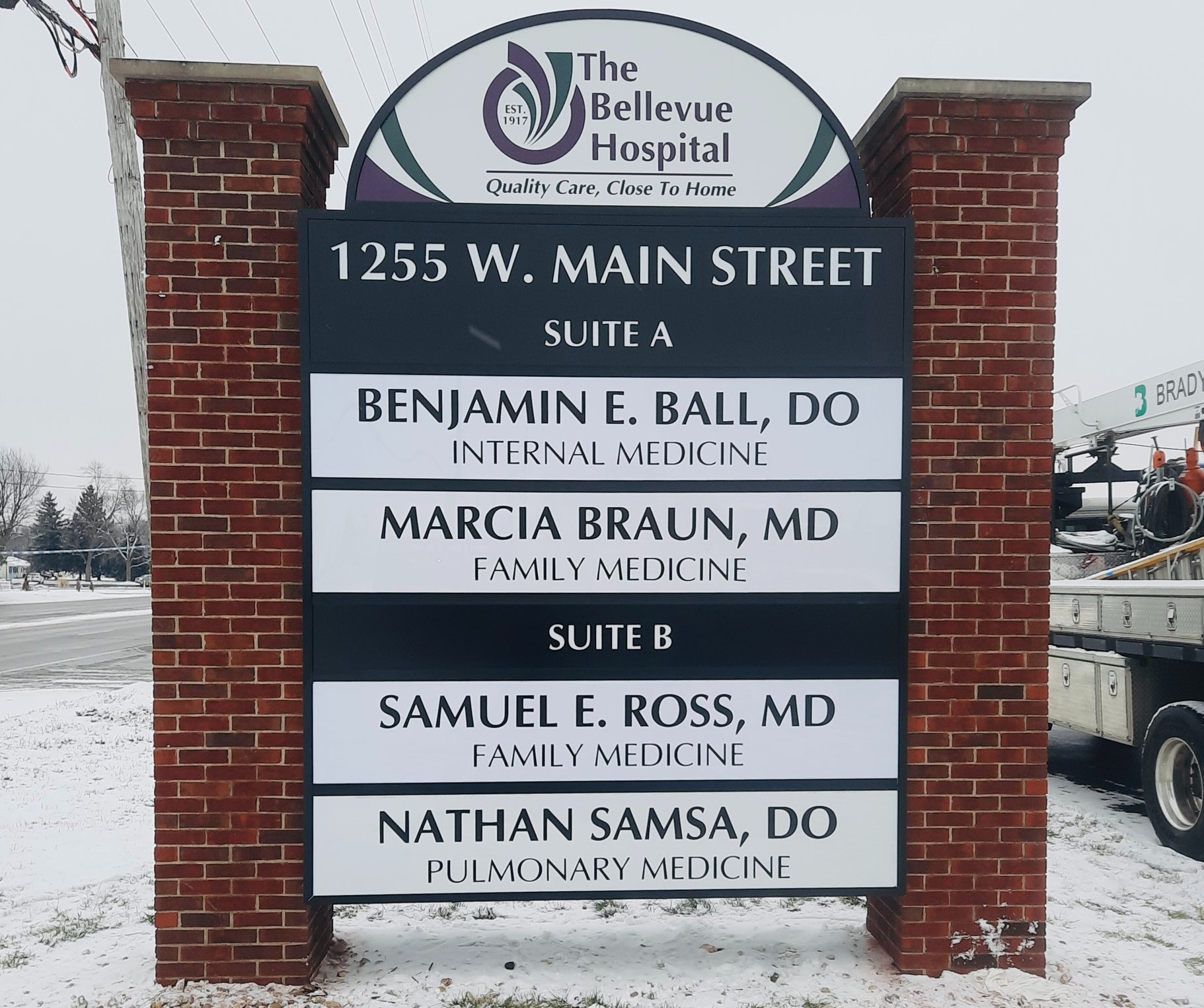
Monument Signs for Professional Environments
Monument signs communicate permanence and established presence, helping your clients feel confident in your long-term stability and reliability.
Professional monument signs typically feature:
- Substantial construction suggesting longevity and stability.
- Natural materials like stone, brick, or high-quality composites.
- Refined dimensional lettering rather than flat vinyl graphics.
- Subtle illumination that provides visibility without gaudiness.
- Landscaping integration creates a polished overall presentation.
These signs tell prospective clients you’re invested in your location for the long term. You’re not a fly-by-night operation that might disappear. You’ve made permanent improvements to your property that signal stability.
Monument signs also solve practical visibility challenges for professional offices, often located in:
- Converted residential properties on tree-lined streets.
- Office parks with multiple buildings sharing a similar appearance.
- Mixed-use developments where professional services sit among retail.
- Historic districts with sign restrictions limiting other options.
Size considerations differ from retail applications. Professional monument signs don’t need to scream from 500 feet away. They need to clearly identify your practice for clients who are already looking for your specific address.
Appropriate sizing allows:
- Easy reading from vehicles approaching at neighborhood speeds.
- Clear identification from parking areas without overwhelming the property.
- Professional appearance that enhances rather than dominates the landscape.
- Compliance with municipal sign codes is often stricter in professional zones.
Multi-tenant professional buildings benefit from monument signs that list all practices in a consistent, coordinated format. This creates a campus-like atmosphere, suggesting an established professional community rather than transient individual operators.
The investment in quality monument signage pays returns through enhanced perceived value. Clients subconsciously assign higher trust and expect premium service from practices with polished, professional presentations. The practices that recognize how critical first impressions are to professional trust understand that marketing your business with custom business signs means investing in solutions that enhance credibility and attract the right clients.
Building Letters Appropriate for Professional Settings
Building-mounted letters provide another excellent option for professional services, particularly for practices in office buildings or converted structures where monument signs aren’t feasible.
Professional building letters differ from retail channel letters:
- More conservative sizing relative to the building facade.
- Classic letterforms rather than stylized or decorative fonts.
- Refined finishes like brushed metal rather than glossy plastics.
- Subtle halo illumination instead of bright face-lit options.
These differences matter tremendously for professional perception. Oversized, brightly lit channel letters might work perfectly for restaurants, but signal poor judgment for law offices or medical practices.
Material selection communicates quality:
- Brushed stainless steel suggests precision and permanence.
- Bronze or brass conveys traditional professionalism.
- Painted aluminum offers durability with appropriate refinement.
- Acrylic letters work when properly designed, but can look cheap if executed poorly.
Mounting methods affect both appearance and longevity:
- Blind-mounted letters create a clean appearance without visible hardware.
- Properly spaced standoffs add dimensionality and shadow depth.
- Precise alignment demonstrates the attention to detail that clients expect.
Color choices typically lean conservative:
- Deep blues, greens, or burgundies rather than bright primaries.
- Metallic finishes maintain a professional appearance.
- Black or dark gray for maximum readability and a classic look.
- White works but requires careful design to avoid looking bland.
Illumination serves functional purposes without creating spectacle. Professional practices need visibility during evening appointments or consultations after standard business hours. But the illumination should enhance professional appearance, not create attention-grabbing displays.
Many professional practices find that exploring options beyond standard solutions, like understanding how non-illuminated signage can maximize impact in certain professional environments, helps them strike the right balance between visibility and restraint.
Regulatory and Industry-Specific Sign Restrictions
Professional service providers often face sign restrictions beyond standard municipal codes. Industry regulations, professional association standards, and licensing board requirements all affect what you can display.
Common regulatory considerations include:
- Attorney advertising rules vary by state bar associations.
- Healthcare licensing boards regulate medical practice signage.
- Accounting profession standards governing public practice identification.
- Real estate licensing requirements for office signage.
- Financial services regulations affecting advisor identification.
These restrictions typically address:
- Prohibited language or claims about expertise or results.
- Required disclaimers or license number displays.
- Restrictions on imagery or graphics deemed inappropriate.
- Limitations on competitive comparisons or guarantees.
- Professional designation usage and display requirements.
Failure to comply creates serious problems:
- Licensing board complaints and potential sanctions.
- Professional liability implications if claims prove inaccurate.
- Malpractice insurance issues related to advertising compliance.
- Reputation damage from unprofessional or prohibited messaging.
Professional sign companies experienced with your industry understand these regulations and design compliant solutions. They know which language works and what creates problems with regulatory bodies.
Municipal restrictions often apply differently in professional zones:
- Size limitations are more restrictive than commercial districts.
- Illumination restrictions protecting residential character.
- Design review requirements ensure architectural compatibility.
- Setback rules limit sign placement options.
- Historical district regulations preserving period aesthetics.
Professional buildings in mixed-use or historic areas face particularly complex regulatory landscapes. Your sign company should handle permit applications and navigate approval processes rather than leaving these technical requirements to busy professionals.
Zoning variances sometimes become necessary for optimal visibility. Professional practices occasionally require exceptions to standard rules due to unique property characteristics or legitimate business needs. Experienced sign professionals know how to present variance requests that municipalities approve.
Maintaining Visibility While Projecting a Professional Image
The central challenge for professional service signage involves balancing two competing needs: standing out enough to be found easily while maintaining appropriate professional restraint.
You solve this through strategic choices:
Location and placement create visibility without requiring oversized or flashy signs. A well-positioned monument sign at your property entrance provides clear identification without overwhelming the landscape.
Quality materials and fabrication allow smaller signs to command attention through refined appearance rather than sheer size. Dimensional letters with subtle illumination draw the eye more effectively than larger, flat signs made from cheap materials.
Proper illumination ensures evening visibility for clients with after-work appointments while avoiding garish lighting that suggests different business types. Halo-lit letters or ground-mounted monument lighting provide elegant solutions.
Clear, simple messaging helps smaller signs communicate effectively:
- Your practice name and primary service area.
- Essential contact information, if appropriate for your sign type.
- Professional credentials that differentiate your qualifications.
- Nothing else is cluttering the message or diluting its impact.
Professional service providers sometimes struggle with the minimalism professional signage requires. They want to communicate everything about their practice, list every service area, mention every credential, and award. That creates cluttered signs that work poorly.
The best professional signage follows the principle: less information, better communication. Your sign exists to identify your location and establish credibility. It doesn’t need to replace your website or brochure.
Consider how your signage integrates with your overall professional image:
- Does it match the quality level your fees suggest?
- Would your ideal clients find it appropriately professional?
- Does it differentiate you from lower-tier competitors?
- Will it remain appropriate and attractive for 10-15 years?
That final question matters tremendously. Professional services build long-term client relationships and reputations. Your signage should reflect that permanence rather than following temporary trends that date quickly.
Strategic investments in professional signage pay returns through:
- Enhanced client confidence before initial consultations.
- An easier location for clients visiting your office.
- Differentiation from competitors with inferior presentations.
- Justification for premium fees through professional appearance.
- Long-term value from durable, timeless design.
The practices that recognize how critical first impressions are to professional trust don’t cut corners on signage. They invest appropriately in solutions that enhance rather than undermine their credibility.
Your competitors either understand this, or they don’t. Those who get it attract clients who value professionalism and quality. The ones using cheap, flashy, or inappropriate signage attract different client segments or struggle to attract anyone at all.
Professional service signage isn’t about getting attention. It’s about earning trust. Those are fundamentally different goals requiring completely different approaches.
Brady Signs is a third-generation family business that has been a premier provider of business signage solutions throughout the North Central Ohio region and beyond for over 50 years. We’re here to discuss how our eye-catching signage can transform your brand into a statement.