How to Make Non-Illuminated Signage Pop, Day or Night
- July 28, 2017
- Posted by: Ryan Brady
- Category: Branding, Custom Signage, Design, Non-Illuminated Signage
It’s no secret — high-quality signage is key to drawing attention to your business and getting people to buy, not pass you by. After all, what’s more eye-catching than a big bright sign or an electronic message center? But what if you can’t use bright lights or digital displays? Can non-illuminated signage make an impact?
Yes, it can! Non-illuminated signage can be just as effective as any other piece of signage — when it’s properly designed, fabricated, and installed.
If local or building regulations restrict the usage of illuminated signs, here’s what you can do to make your business’s non-illuminated signage pop, day or night.
What is Non-Illuminated Signage?
Affordable and versatile, non-illuminated signage comes in many shapes and forms. These signs, as the name suggests, don’t have an internal light source. They may be lit by an exterior lighting source to keep them visible at night, but generally, they rely on colors and materials to make an impact.
Examples of commonly used non-illuminated signage include:
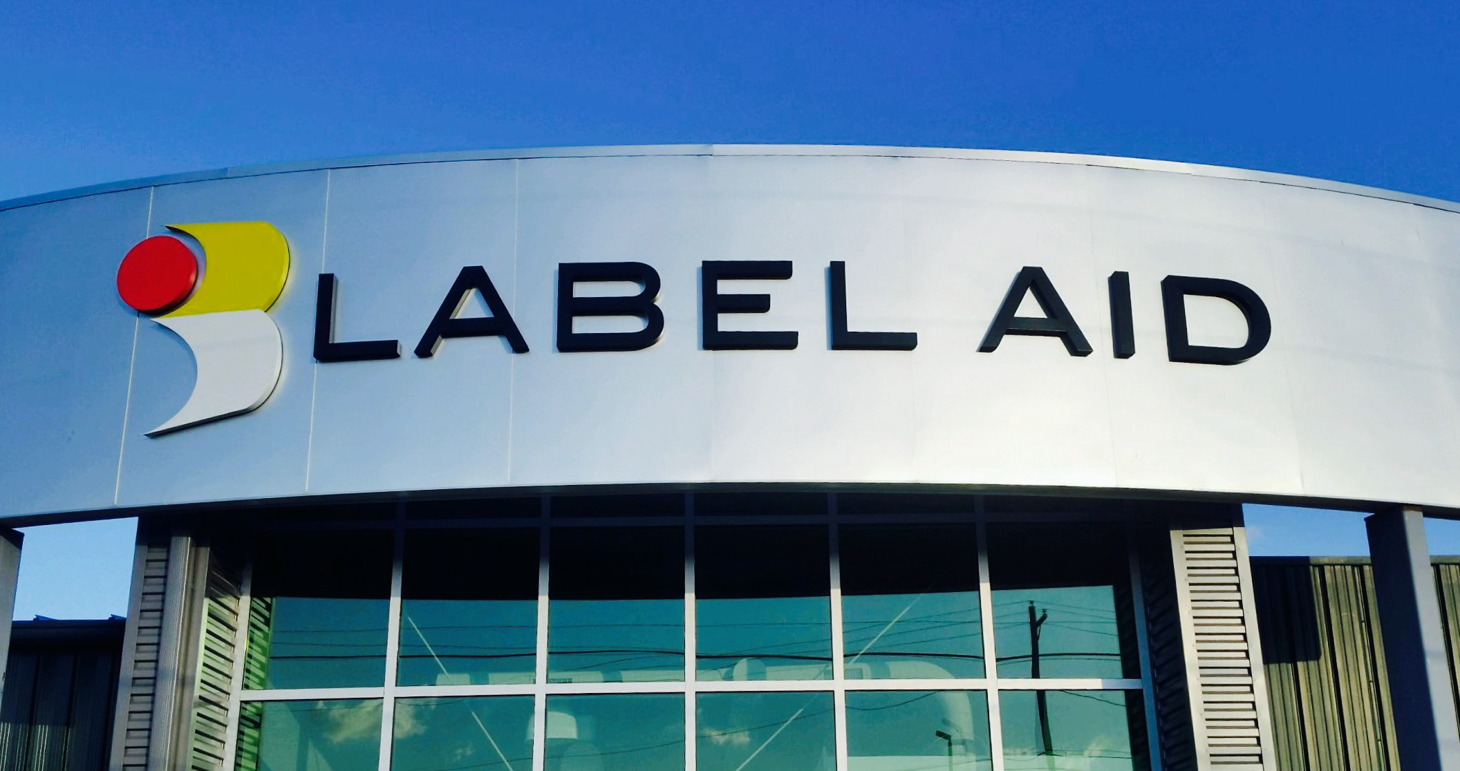
- Non-Illuminated Letter Sets and Logos — Flat cut-out and dimensional letters made from a variety of different substrates including aluminum, acrylic, PVC, HDU, and stainless steel. These can be used for exterior and interior applications.
- Non-Illuminated Awnings — An architectural structure that is mounted to a building. This is typically an aluminum frame system that is covered with vinyl, canvas, or metal panels.
- Wayfinding Sign Systems — These signs help customers navigate a building or an outside area such as a parking lot.
- Non-Illuminated Wall Signs — In many cases, these wall signs are built from flat or pan-formed aluminum panels. When combined with dimensional letters and exterior lighting, the end result often ends in an eye catching result.
- Routed HDU Signs — HDU, more commonly known as sign foam, is another popular substrate for non-illuminated signage. With the ability to route an unlimited number of shapes, layers, and textures, the sky is the limit for this style of signage. HDU signs are commonly used in wall mount and freestanding applications.
Where is Non-Illuminated Signage Typically Used?
Sometimes, local or building regulations are restrictive when it comes to illuminated sign usage. You’ll often find restrictive regulations in historic districts. This is true in our hometown of Sandusky, Ohio, where the internal lighting of signage within the historic downtown area is strictly forbidden.
One of the other reasons one might find themselves selecting non-illuminated signage is due to electrical access issues. If primary electric is not already available or simply too costly and/or complicated to run, non-illuminated signage may be your only answer.
How to Make Non-Illuminated Signage Pop
One of the best ways to make non-illuminated signage pop is with the use of dimension. We don’t live in a 2D world, so why shouldn’t you do more than use flat panels with flat graphics on them? With that in mind, dimensional signage including 3D lettering is available in a wide variety of materials, such as:
- Brass — Solid brass letters make your business look and feel more respectable.
- Bronze — Stand out with a polished or brushed look that’s sure to impress.
- Stainless Steel — Steel letters are weather resistant for a look that stands the test of time.
- Aluminum — These letters not only have a classic (and customizable) look, but they’re cost effective too.
- Acrylic — Match your company’s colors with these letters to help your space feel more on brand.
- Metal Laminate — These won’t break the bank and can be made to look similar to solid metal.
- PVC — This composite material can be routed and painted as an affordable alternative to more expensive substrates when dealing with thicknesses between .25-in. and 1-in.
- HDU (High-Density Urethane) — Another composite material that is commonly routed and painted as an affordable alternative to more expensive substrates when dealing with thicknesses between 1-in. and 2-in.
Regardless of what material you choose, remember the basics. This includes height, size, color, and placement. Even though a sign might look striking and vivid on its own, it still needs to contrast with the local background and/or compete with other nearby signs.
Contrast is important, too. A sign’s readability is mostly due to the contrast of the letters against the background color of the sign (light letters on a dark background, or dark letters on a light background). Another approach is to have a dark border around the letters against a light background. In any case, contrast improves readability, and it delivers greater aesthetic appeal.
At Brady Signs, we’re a third-generation family business that’s served as a premier provider of business signage solutions throughout the North Central Ohio region and beyond for nearly 50 years.
Want to learn how we can convert your brand into a statement using our eye-catching signage for business? We’re here to talk.